Wednesday, September 28, 2011

Wait...How do I turn this thing on???

I had a rough start with this little device, as at first, I couldn’t figure out how to turn the thing on. After a slightly embarrassing tutorial from Arnie (it was ridiculously easy after he pointed out the switch), I had it figured out. I had heard from several co-workers how awesome the kindle is, so I was excited to give it a try. Unfortunately though, the rest of my experience with it followed suit with my frustration in the beginning.

I, like several other cohort members, own an iphone and absolutely love it. Which means…I wanted so badly for the kindle’s screen to be a touch screen! I poked at it multiple times, forgetting that nothing was going to happen, regardless of my persistence. That was a major disappointment to me, as I feel like not having a touch screen just made everything more difficult. I was expecting to be able to turn the page with the swipe of my finger, but instead I had to try to figure out the buttons on the sides. It took me a pretty long time to get the hang of this, and I ended up on the wrong “page” multiple times. That’s pretty frustrating when you’re trying to read the instruction manual. The keyboard was hard for me to use, because my thumbs didn’t meet in the middle of it. I had to put the kindle down on my lap to type anything, instead of doing so while the device was in my hand, like with my iphone. Instead of being able to use my finger to highlight, I had to use buttons, and so on and so on.

I’ve been considering an e-reader for a while, because as a teacher it would be nice to have access to all of the books I need without lugging around a giant bag. Some of the features on this device aren’t really classroom- friendly, though. There are no page numbers, so it would be hard to direct the kids to a certain place for close reading (broken!). Also, I had a hard time figuring out how to highlight or add a note (again, I felt ridiculous when I finally figured it out, because it’s pretty easy), and when I did highlight, it was very hard for me to see. I felt like there was very little contrast between what was highlighted and what was regular text. While carrying the kindle isn’t going to break my back, if it doesn’t serve the purpose I need it to, its lightness and portability are irrelevant.

There are certain things I enjoy about reading and going to bookstores. One of those things is browsing through my favorite section and looking at the covers of different books. With the kindle, I wasn’t enticed by any of the covers, as they were flat black and white. (I really liked the “e-ink” in other regards though, since I have very bad eyes, and usually can’t look at an electronic screen for long periods of time without irritation and discomfort. I also liked that I could make the font bigger to ease the strain on my eyes, but I digress…) I also like to relax and sit on the couch with a book in my hand, and my finger perched between my current page and the next one, ready to turn. The kindle is light, but it felt HUGE in my hands (I can’t explain this. I know it’s small, but it just felt so big), and there was no sense of excitement with my finger poised for the next page.

Usually when I read, I lose myself in another world. Using the kindle made me feel like I had wandered into a world in which I didn’t belong. I think a touch screen and a more user friendly, intuitive interface are musts for me in an e-reader. Maybe I will have better luck with the nook. From what I understand, it has both of those things. Until then though, I think I’ll lug around my paperbacks.
Tuesday, September 27, 2011

The Kodansha Files

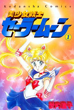
Beginning in October, I will be tracking Kodansha USA, an American subsidiary of Kodansha, Japan's largest manga publisher. Why? Great question, I'm trying to discover when or if Kodansha USA intends to digitize its catalog. More specifically, I want to know which digital format it will use. Personally, I'm excited to see Sailor Moon as an iPad app. Still, Kodansha might prefer to keep its catalog solely in print. I don't know, but I do know whatever happens it makes for an interesting read, which brings me to my next point.
 

My blog, An Uncoventional Publisher focuses on new jobs for publishers in The Digital Age of Books.
As an aspiring publisher, I must understand traditional publishing and feel comfortable using new technologies. This reality mirrors that of today's publishing houses.That's why I believe my class assignment meshes perfectly with this blog.

Moreover, I think it's a great way to introduce Sailor Moon to unfamiliar consumers. If no one has ever heard of Kodansha Ltd, that's to be expected. Most readers have heard of Stephen King, but have no idea who his publisher is. On the other hand, if readers have never heard of Sailor Moon then that's a travesty. 
I'm introducing The Kodansha Files to do my homework and support Sailor Moon

Look out for Kodansha Files first entry October 15. In the meantime, I'm asking readers to do at least one of these four things:
  • Message me if you have any relevant links, tweets or articles OR
  • If you don't think Sailor Moon makes a great e-book say it and support it OR
  • If you think Sailor Moon makes a great e-book say it and support it OR
  • Post an e-book fail or an e-book pass; I know they're out there.

Looking forward to seeing you on Oct.15,  

Latesha Goodman
Author of An Unconventional Publisher Confesses
www.lateshagoodman.wordpress.com 

Disclaimer, if you don't feel comfortable with me including your real name let me know. This blog is attached to my public Wordpress blog; everything you say will be publicized. I don't mind someone disagreeing with my standpoint, I only ask for people to be respectful. I don't mind comments that have cursing, dirty jokes or graphic pictures. If you have examples that contain nudity that's fine too; if it's relevant then I'm on board. I only ask that your argument have validity and your comments aren't personal.

Labels: , , ,

Monday, September 26, 2011

Don't Mind Me, I'm Just Reading My Kindle

Last week, I a the chance to check out our class Kindle. It was an interesting experience.

I ride both the bus and metro to get to class (and just about everywhere else), so to stay entertained while waiting forever for the bus to come and during my commute, I've taken to reading books on my phone or iPod touch. My phone came with the Kindle app pre-loaded, but I've always been a B&N girl, so Nook is my e-reading app of choice. But I digress.

When I got off the metro and into the line for the bus last Monday night and pulled out the Kindle to start my antisocial reading ritual (I've found that head phones and a book/electronic device tend to ward off the weirdos) the first thing I noticed was how uncomfortable it made me. Forget uncomfortable, I felt downright ostentatious. The Kindle is not much bigger than the average book, but something about it just screamed (to me at least) "look at me! look at me! I've got a huge e-reader" and I felt embarrassed to be holding it. I'm sure that once I got used to having one, I wouldn't feel that way, but at that moment, all I wanted was my teeny tiny phone screen.

Of course, I also felt a little silly because I had a few problems figuring out how to use the darn thing. I got into the book fine, but then I kept hitting the wrong buttons while trying to turn the page. To go to the next page on a Kindle you push the large bottom arrow (circled in red in the picture) located on either side of the machine. To go back a page, you push the smaller arrow button on the top (circled in blue). If you ask me, having the buttons in the same place on both sides is sort of counter intuitive. I kept pushing the large button on the left expecting to go back a page, and not realizing I had really gone forward, getting very confused when I couldn't find the beginning of the chapter. I'm pretty sure this is supposed to be a clever feature that allows the reader to hold it with either hand and turn the page in either direction, but I don't think it works. It's BROKEN.

At this point I was really missing my touch screen phone/iPod.

Visually, page turning is something that the Kindle does have going for it. On my Nook app for iPod touch, when I turn the page the words sort of zoom across the screen and are replaced with a new page worth of words that zoom into their place. It sort of makes me feel seasick to look at. On the Kindle, the words sort of cross-fade, with the current page dissolving and the new one reappearing in it's place. It's very innocuous and good for reading while traveling. My favorite page turning method, however, is in my Android Nook app, which animates a page turning. I like it because it makes me the least dizzy.

I also checked out the Kindle store on the Kindle. As a die hard, "buy it for the cover" book buyer, I found the black and white monotone pictures very unappealing and was far less likely to investigate a book further without the lure of attractively colored covers. I also noticed that a lot of the "most popular" books in the Kindle store weren't the traditional bestsellers, but a bunch of books that sold a lot because they were either free or only $.99. That threw me for a loop too. But it was very easy to buy a book (or in my case, a free sample of a book) and it loads right onto the device, which is pretty cool.

Overall, while I eventually figured out how to use and navigate the inner workings of the Kindle, I never really felt comfortable using it. So, for now, I think I'll stick to my color, touch-capable phone or iPod while reading on public transportation, and paperbacks for the rest of the time.

Labels: ,

The Nook Color-B&N vs. iPad 2-iBooks

First I’d like to ask you to all bear with me. I’ve only had my iPad 2 for a few weeks and over the past few days I’ve been investigating the Nook Color. The biggest difference of course is access to the 3G Network. I will say though, even when Wi-Fi was available I had trouble logging in with the Nook.

In my mind, the iPad with iBooks wins the User Interface Award hands down. I think it all comes down to the size of the screen. The iPad has a much bigger screen. Therefore, all your tools are in plain site. The Nook is not as intuitive. I found myself surfing the web to find out how to create a note or bookmark. The web refers you to the manual. Oh please, don’t point me to a manual I don’t have access to. This is suppose to be fun!

On the other hand, I downloaded the digital version, on my iPad , of the Great Cover-Up. In the hope, I’ll help Barry Sussman reach his 18 copies for the week. At the beginning of his book, it actually gave me directions on how to make notes and bookmark. Brilliant! What a time-saver!

I also did another little experiment. I let my 65-year-old mother test-drive the Nook as well as the iPad 2. The Nook was too much for her to handle. Again what do you push? How hard? How do you find all these hidden menus? She did struggle a bit with the iPad 2 but in the end was much more successful at manipulating it. Thankfully, my iPad 2 is staying. So Nook Color, it’s back to class for you.

Sunday, September 25, 2011

Poll: 15% of Americans use an e-reader

A new Harris Interactive poll found that one in six Americans uses an e-reader.

The poll also found that among those who do not own an e-reader, one in six plans to purchase one in the next six months.

Nearly 33% of folks who own an e-reader read 11 to 20 books annually, while 27% read 21 or more books per year, according to the poll.

Labels: ,

Friday, September 23, 2011

Industry Article - Lobster Press

http://www.publishersweekly.com/pw/by-topic/childrens/childrens-industry-news/article/48785-lobster-press-pauses-to-catch-up.html

This is the article that I will be presenting on Monday, September 26.

- Kerrianne

Tuesday, September 20, 2011

"The Life of Samuel Johnson" on eBooks

As demonstrated in class last night eBook conversions are not perfect.
Whether it is the mentality of "it's not my job" or "I'm not a fish" the proofing step should not be overlooked. The name Penguin Classics implies top-notch publishing integrity and editorial quality, and "The Life of Samuel Johnson" by James Boswell did not receive it.

The Kindle eBook edition of Boswell's work costs $12.24. So I opted for the free sample, which gives you approximately 10-15% of the book (usually Front Matter and beginning of a first chapter). Even from this small sample I detected multiple format and content issues such as: "principles'ofwhich, asBoswellrecords, Johnsonhad'Muchexperience'. Boswell's famousimage" or "He was from the beginning '$$$$, a king of men."
I can only imagine it continues throughout the Kindle version.

The Nook eBook edition is free. And although it's not the same edition as the Kindle, format and content was horrible, one such example is:
"Ovre reus e7riavecrTaTai9 7rpa£eo-i ttolvtus tvecrTi S^Awcris dper^s rj Ka/aas, aXka 7rpay/xa fipayy ttoAAcckis, kcli pv)fJ"
This happened throughout the text, in large batches as above and in hidden in words or short sentences.

The best way to proof eBook conversions is looking off a hard copy of the text to see how the content is suppose to be presented - borders, indentations, spacing, grammar, spelling, font, size, etc. - and making the correct adjustments for the eBook to appropriately represent the original text on a different platform. Not having a hard copy of Boswell's book, I could only detect the obvious errors (as noted above) - but there could have been more had I been comparing eBook to book.

Since these errors (format, missing content, special characters) appear in some way on three different devices (Nook, Kindle, iPad) it leads me to believe that Penguin sent a corrupted InDesign or PDF file to get converted to ePUB. Penguin then did not thoroughly proof the final ePUB version but instead sent the final file for submission to Amazon, Barnes and Noble, Apple, and possibly other vendors, who accepted the file for resale.

"The Life of Samuel Johnson" on eBooks is broken.

Labels: , , , ,

Monday, September 19, 2011

National Book Festival

This Saturday and Sunday, the 24th and 25th of September, is the National Book Festival on the National Mall. Check it out!

http://www.loc.gov/bookfest/

Sunday, September 18, 2011

Stop poking it, it's not a touchscreen....Kindle Edition

I've never used an e-reader before. Actually, I've barely ever seen one. It's not that I'm against Kindles or anything like that, I just never really had a use for one. As a English major, I spent most of my time reading the literature books I was required to buy in the traditional paper format. Since I read so much for class, I rarely had the energy to read anything in my spare time (if I had spare time). Therefore, when I received the Kindle in class, I was really looking forward to seeing if they were as great as everyone had said. So begins the story of my Kindle experience.

I was really determined to figure this thing out by myself with no help from friends or the Internet. I think the only way to discover if a device is truly user friendly is to give it to a user (me) with no instructions and see how they manage. Honestly, sometimes things were easy to use, sometimes they were hard to use and sometimes things were hard because of my own stupidity. For instance, after turning the Kindle on (I loved the beautiful images during sleep mode), I proceeded to poke the screen continually. Let me explain. I own an iPhone, which is a touchscreen. If I want something, I poke it and it magically does what I want. Though I knew the Kindle was not a touchscreen, my mind was set on touchscreen mode. It saw a screen and wanted to poke it. I inadvertently did it so many times that my friend (sitting across the room staring at me) had to yell out, "You know it's not a touchscreen, right? " Yes, I knew. After that, my mind got the message, and I moved on.

The first thing I really enjoyed was the e-ink. I'm not a big fan of LCD lighting. It hurts my eyes, so the clarity of the page was much appreciated. The major thing I had a problem with was the arrows. There are three sets of arrows on the Kindle and some of them perform the same function while others can only be used for one specific thing. I kept thinking, "Which one do I use?" Sometimes I would press the wrong arrow, and I'd end up on some page I didn't want to end up on. It was frustrating, and I wish the creators would just streamline it, so there would be no confusion.

While I'm discussing things that should be streamlined, I should also mention that the 'menu', 'home' and 'back' keys were a bit annoying. I kept pressing the wrong one (forgetting that menu and back wouldn't take you home) and (again!) ending up on the wrong page. Another minor thing I had trouble with was learning how to delete something from the home page. Remember, I had no help, so it took me some time to realize I could arrow over each book to learn more about it. The delete option should be more accessible. Another thing I feel should be added is numbers on the keyboard. I know there are number options under 'symbol' (shamefully, it took me a while to figure that bit out), but I use numbers a lot when writing notes, and I think there is enough room on the keypad to include this option.

Those were really the only problems I had with the device, and they were minor. Actually reading on the Kindle was a great experience. I have to say that I'm more comfortable with it than I thought I would be. I loved the fact that I could scroll over a word and see the definition. That is such a useful tool. It saves the reader tons of time and allows them to understand the text better. I also thought adding notes was fairly easy. I liked seeing what others had underlined throughout the text, and the notes weren't too hard to review later on if needed. Adding texts to the library was another task that was surprisingly easy. Once I logged onto the Internet, it was incredibly easy to search a work and download it. The book was there within seconds. Really amazing.

So my experience with the Kindle is coming to a close, and I must say that it has me thinking of purchasing one in the future. I'm not entirely sure yet. I'd like to see some improvements made to it, but now it is definitely a possibility.

2 cool! The iPad 2

Pros: The color display is sharp, impressive, and lends itself well to e-reading. Apps like Morris (an interactive picture book with moving pictures and audio) and T.S. Eliot's The Wasteland (which includes analysis and commentary, images of original drafts, readings of selected sections, etc.) show how much the iPad's features can enhance the reading experience. I didn't have any trouble with the backlit screen, but found the slight glare from a lamp faintly annoying. iBooks, Apple's e-reading app, was easy to use; the shelves were visually a nice way to organize content, and I like that iBooks can view and store PDFs. In-text features like the dictionary, bookmarking and highlighting were helpful, too (though how to "un-highlight"?). Most importantly, being able to access a class syllabus, Wikipedia, or anything on the web while reading was hugely useful. When compared to the black-and-white Kindle, for example, a multitasking color tablet seems like a no-brainer.

Cons: The iPad gets heavy quickly if simply held in your hand. Although I used it only on the Metro to and from work, and for a few hours one evening, the battery was down to 70-75% after relatively little use. It's also quite expensive, even for all of the iPad's capabilities. A small quibble: when viewing PDFs (though the ability to do so is nice), a reader can't continuously scroll down. This means that, unless the page is at full-screen zoom (often rendering the text illegible), you must scroll down, then flip sideways to continue reading. And a final note: different orientations resulting in different layouts, I found that being unable to picture the position of text on the page made it more difficult to recall the content, for some reason.

Bottom Line: Though a staunch fan of print, I'd definitely purchase an iPad 2... if I had $500 lying around.

Labels: ,

Saturday, September 17, 2011

Dating the Kindle

I have to start out by saying that I have had some limited experience with an Ipad and I do own (and love) an Iphone so I had some difficulties in my new Kindle relationship.
There are a few things that are very important to me in any relationship:
Looks- The first thing that struck me about the Kindle was its appearance. I would say that it's not exactly sexy. My initial reaction was that it looked a bit like a glorified graphing calculator. That being said, I enjoyed using this little guy alot more than I ever liked any of my calculators.
Physical Chemistry- It took me longer than it probably should have to realize that it was not going to respond to my touch. I learned this after spending at least a minute trying to expand the view with my fingertips. The fact that the Kindle is not touch operated was something that I had to continuously remind myself of throughout our time together- just an iphone habit I had to break.
Being on the Same Page- The single most frustrating aspect of my reading experience was the directional arrows for paging on each side of the device. Both the left and right sides of the Kindle have one small arrow button above a larger arrow button. Now, my brain kept telling me to turn from page 1 to 2 I should click the arrow button with my right hand and oppositely, to go back from page 2 to 1 I should hit a button on the other side with my left hand. THIS IS NOT THE CASE. Both of the larger buttons progress the pages forward and both of the smaller buttons went backwards. Maybe I missed something here, but this seemed really alien to me. I often found myself on page 4 when I was expecting to be on page 2.
Corny relationship analogy aside, I did enjoy using a dedicated e-reader. The built in dictionary was probably my favorite tool. I know that in my general book reading, when I do not know a word it has to be pretty important for me to actually look up a definition, but using the Kindle, if my cursor was on the word, a definition appeared at the bottom of the page. I am willing to bet my vocabulary would benefit from this feature. I also liked being able to see the passages that were frequently highlighted by other readers and then have the ability to turn that feature on or off at my discretion.
Overall, I enjoyed using the Kindle. It definitely convinced me that I need to invest in an e-reader for my very own, but I have a suspicion that after a little more dating I will end up in a happy, healthy relationship with a Nook Color.


The Digital Bookmobile is coming to town!

You can check out the "E-book Experience" and "Gadget Gallery," but more importantly this tour lets public libraries "promote downloadable eBooks, audiobooks, music, and video." E-book lending is apparently alive and well.

The Bookmobile is in Arlington on Sept 21, and in Washington DC Sept 24-25 (to coincide with the National Book Festival).

http://www.digitalbookmobile.com/

Friday, September 16, 2011

The Nook Color: Eye Opening

It’s funny how things happen sometimes. A few days ago I simply raised my hand in class, picked a number between one and three and then:

I have a Nook!

Immediately after, I'm thinking:

Wow. This is very expensive. Where’s the case? I should probably have a case for this. Better yet, a pink one. A pink case with a glittery letter “N” on the front. Do they sell those anywhere? Oh right. This isn’t mine. I’m borrowing it! Well, how does this thing turn on?

I press down lightly on the “N” button at the bottom of the device. My eyes are immediately alerted: this is not a Kindle. This is the future of e-book reading led by a bright colorful screen and a menu. Let’s not forget to mention its touch screen capabilities.

 This is…kind of…cool.

I have to admit that until now, the way I’ve felt about the Nook is similar to the way a New Yorker feels about Times Square. It’s interesting and pretty to look at, but it’s only one part of the city. To me, the Nook is one of many avenues to travel down as a reader. Because I am an avid reader, I should represent Nook’s core audience right? Although as a woman, this might hold some truth, (check out this article about Nook Color’s audience at http://www.nytimes.com/2011/05/23/business/media/23nook.html) I am more than a little hesitant.

In my short lifetime, I’ve seen computer desktops progress to laptops. Remember when desktops were first available for personal use? That was a big deal! Now print books are quickly being converted to e-books. Technology is advancing it seems every hour on the hour. Is this why it has taken more than two years for my mind to be sold on the e-book idea?

Well, maybe now is the right time.

Ingrained habits or views are stubborn. They don’t change overnight; it’s a steady progression. Despite appearing otherwise, technology (especially as far as devices for e-books go), has accelerated only recently. Now it’s taking off from the runway and speeding towards the future. Hopefully, it’s bringing all of us closer together. Besides making life “easier” and “less complicated” technology should serve us as a community; build a bridge between gaps and enable us to help one another. 

Things I like about the Nook Color:

1. The look. It’s sleek and its design is very modern. (“The Nook’s got the look” could be a new catchphrase. Watch out!)

2. The ability to read in color. This really makes a difference in the reading experience, especially when compared to the Kindle. I imagine this is the way moviegoers must have felt in 1939 when they saw Gone with the Wind for the first time in glowing Technicolor.

3. The menus. It’s like having a mini-laptop. It definitely adds a touch of personalization.

4. The “virtual bookshelf.” It’s a clever concept. This shows how Nook designers are trying to make the device more relatable by simulating the activities associated with reading—even something as simple as taking a book off a shelf.

So will I be standing in line at the nearest Barnes and Noble store to buy my first Nook this weekend? It’s definitely something worth considering. Although it's quite possible that by the time I'm ready to make a purchase, designers will come out with Nook Color 2.0: The Next Generation.

Thursday, September 15, 2011

The Future of the Book

Has anyone else seen this before? I watched this video about a year ago and thought it was really neat! It shows three digital book concepts named Alice, Nelson & Coupland. Take a look...

The Future of the Book. from IDEO on Vimeo.

Labels: , ,

Tuesday, September 13, 2011

Collaborating on Google Docs

Hello everyone! Patricia Horan brought this new feature of Google Docs to our group's attention. I think it's fairly new, so I wanted to post it so that we could all benefit from it. It looks to be a lot like the Track Changes feature in Microsoft Word. I'm really glad you don't just automatically overwrite and therefore completely lose previous versions of the document anymore.

Hope this is helpful!

Labels: